
Colour correction
|
BEWARE!!! Work in progress |
The term colour grading will be used here as equivalent to colour correction.
How to get oriented in the colour wheel
Understanding Cinelerra Color Picker dialog by exploring its parameters is a great way to start understanding the basic concepts of colour correction.
-
Start by setting a Title effect.
-
Then open the Titler (the Title video effect dialog box) by clicking on the magnifier in the effect brown bar.
-
Click on the Color… button of the Titler.
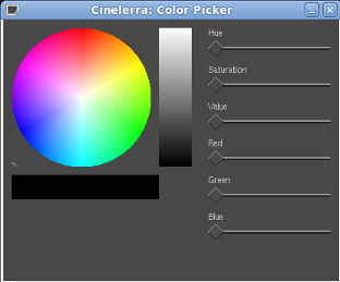
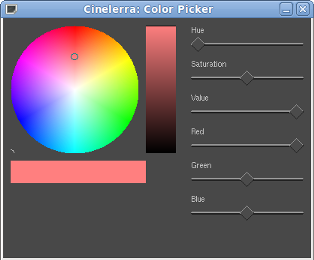
Yu have now opened the Color Picker dialog box.. It’s made of a coloured wheel, a horizontal bar, a vertical bar and 6 sliders.
Before starting the tour, make sure all the sliders are set to 0.
Let’s go!
1. Exploring the dialog
The wheel has three primary colours (Red, Blue and Green) and three secondary colours in between (Magenta, Cyan, Yellow). To understand why the primary colours are Red, Green and Blue instead of Red, Yellow and Blue see PRIMARY COLOURS in the glossary.
In the centre of the wheel there is a tiny black circle. This is the colour selector.
Just below the wheel there is a horizontal bar that shows the selected colour. It should be black.
The vertical bar on the right side of the wheel marks the brightness (or luminance or value) of the colour. It goes from black (at the bottom) to white (at the top).
2. Exploring value
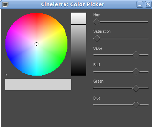
Move the Value slider to maximum. You can see the black selected in the horizontal bar becoming brighter and brighter all the way to white. The vertical bar tracks the change from black to white all through the gray scale.
Note that moving the Value slider other three sliders moved too. They are the Red, Green, Blue levels. They control the amount of primary colour used to get the final selected colour. When all the three primary colours are combined in equal intensity, no colour is produced.
Black, gray and white are not colours. Well… they are in the common sense, but they are not for a colorist. Black, gray and white are the absence of colour with different value, that is different brightness. A black and white picture has plenty of luminance information but no colours.
For the definition of brightness and luminance see the glossary.
3. Exploring hue
If when I combine all the three primary colours in equal intensity I get no colours, then to produce a colour I have to combine the three primary colours with different levels. Let’s try.
-
Move all the sliders back to 0.
-
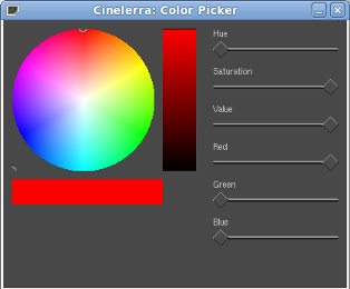
Set Red to maximum. The horizontal bar shows a bright red (in fact the value slider also moved to maximum). Note that the colour wheel selector moved to the maximum red (target). In the experiments at point 2 the selector didn’t move because we were playing with luminance only and not with colours.
-
Note the position of the Hue slider: it’s 0.
-
Now put the Red slider back to 0.
-
Move the Green slider to maximum. Note the wheel selector and the Hue slider position: it moved to 120.
-
Put the Green level back to minimum and set the Blue to Maximum. Again, note the wheel selector and the Hue slider position: This time it moved to 240.
And now:
-
Keep the Blue level to maximum and freely move the Hue slider back and forth. Watch the colour selector running around the wheel! It goes through all the primary and secondary colours and all the intermediate ones. Note the RGB sliders moving along.
-
With Hue=0 the selector is at maximum red, the Red slider is at maximum level.
-
Move the Hue slider to 60 (that is the yellow target): the Green slider moved to maximum and the selector in the colour wheel moved towards the green.
-
Set the Hue at 120 (that is the green target): the Red slider moved to minimum and the selector in the colour wheel moved away from the red.
To know for each selected colour what’s the amount of primary colours, look at the Red, Green and Blue (RGB) levels. Pose the mouse pointer over the knob to get a tooltip with the numerical value.
For istance: the beautiful colour that has hue = 272 is made with a combination of 0.53 parts of red, 0 parts of green and 1 part of blue.
Actually I think it is a little too bright for me. It’s better to lower the value a little. I set the value to 0.80. Haaaa! I like it better!
Note that lowering the value the levels of the colours were lowered too.
This new colour has still hue = 272 but the levels of the primary colours are Red = 0.43, Green = 0, Blue = 0.80.
5. Exploring saturation
Let’s start exploring it with a happy colour.
-
Turn the Red and the Green to maximum to get a nice secondary yellow (hue = 60, value = 1.00). The colour wheel selector is in the yellow target.
-
Slowly lower the saturation. The yellow gets gradually less vivid, down to white. The colour wheel selector moves towards the centre of the wheel.
Let’s try again.
-
Start from a less bright yellow (hue = 60, value = 0.50).
-
Lower the saturation we go down to gray. The selector does the same movement even if we are playing with quite a different colour.
-
Note again that the changes in luminosity (value) are not shown in the colour wheel but only in the vertical bar.
-
Note also that lowering the saturation the Blue slider moves up. In fact we are "killing" the colour by adding it’s complementary colour, that is the colour not present in the combination of primary colours. Blue raise from 0 up to the level of Green and Red. When they have all the same level, there is no colour anymore and only the luminance is visible (white or gray in this case).
Now that the tour has come to an end, I can whisper you a secret: you can select a colour without thinking!
Just drag around the colour wheel selector (for hue and saturation) and drag the little black horizontal cursor in the vertical bar (for value).
How to correct white balance
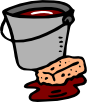
Sometimes you might get images with a weird color cast.
Here is an example of salmonish cast but it can be from gold to blue.
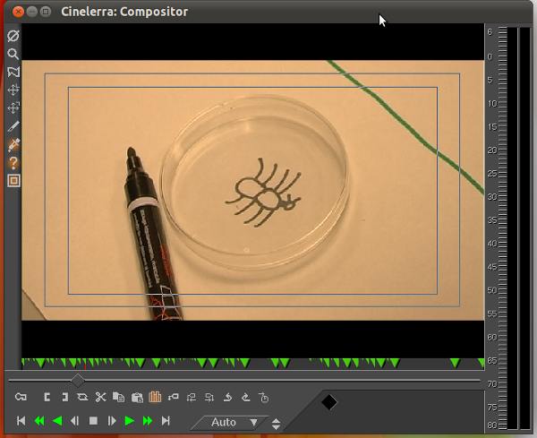
The paper in the background was in fact white. My eyes saw it as pure white. Nevertheless the camera recorded the white as salmon, tinting all the other colurs.
Cinelerra is capable of analizing the colour of a single pixel. Let’s do that:
-
Enable the Color picker by clicking on the Get color eyedropper button in the left controls column of the Compositor window. When hovering over the video in the Compositor the mouse pointer will look like a cross.
-
click on the Show tool info question mark button just below. A tiny window will appear, with a sample of the selected pixel colour and the numbers that represent the levels of the Red, Green and Blu (RGB) primary colours.
-
click and drag your mouse pointer over your image in the Compositor. You’ll have the informations for every pixel you run over.
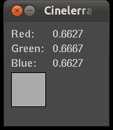
Here are the info for a pixel representing a portion of the white paper.
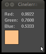
You have learned from the previous HOWTO that neutral colours like white have the same amount of RGB. Note how in our case on the contrary the RGB levels are uneven. There’s a lot of red and very little blue (and that makes yellow appear).
There was artificial light in the room and some light came from the window. Natural and artificial light usually have different colours because they have different temperature. I forgot to tell the camera which colour was the real white and she got confused.
Now we have a problem. What’s the solution?
The real solution is in the camera (and in the operator). You should tell the camera which is the real white so she can store it as reference. Most videocameras have automatic white balancing that usually works fearly well. But in some conditions (like different light sources or tricking coloured walls or objects) the camera gets fooled. All videocameras have the possibility to have the white balance manually set. Check your camera user guide for instructions.
Cinelerra can help you correcting the colour balance of footage you have already shot, thanks to the Colour balance effect.
-
Select the clip you want to correct and apply the Colour balance effect.
-
Open the Color balance effect dialogue.
-
Enable the Compositor colour picker
-
In the Compositor, click on the most neutral pixel you can find on your image (a white or light gray spot)
-
Click on the White balance button in the Colour balance effect dialogue.
After such treatment my image looks like this:
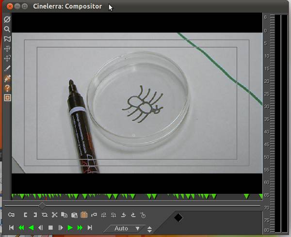
If we analize the pixel on the white paper now we can see very different values:
RGB levels are now nearly even.
The correction is not perfect but the difference is huuuuge!

